Thursday, December 8, 2016

A Collage of Runners

A recent drawing, a collage of drawings really. I like the cat's cradle of lines I can get by overlapping the drawings this way in Photoshop. The colored dots help differentiate them. In a way it's like the montages from films of the 1930s. We'll see how many different ways I can use this.

Wednesday, December 7, 2016

We Deserve Gelato

It's been a difficult month, so let's reward ourselves. I did these gelato delivery vehicles for an article about the logistics of gelato in Rome. Design by Pentagram/Austin. The art director was Julie Savasky.

Tuesday, September 13, 2016

Back to School––Client: Blue Cross/Blue Shield

Art directed by Thea Nelson of Thebe Street Design. This image is one of five panels I illustrated for a wall at Blue Cross's offices here in the Twin Cities.

Pet Health (art for Family Circle


Art directed by Lisa Kelsey and Alison Fedele.

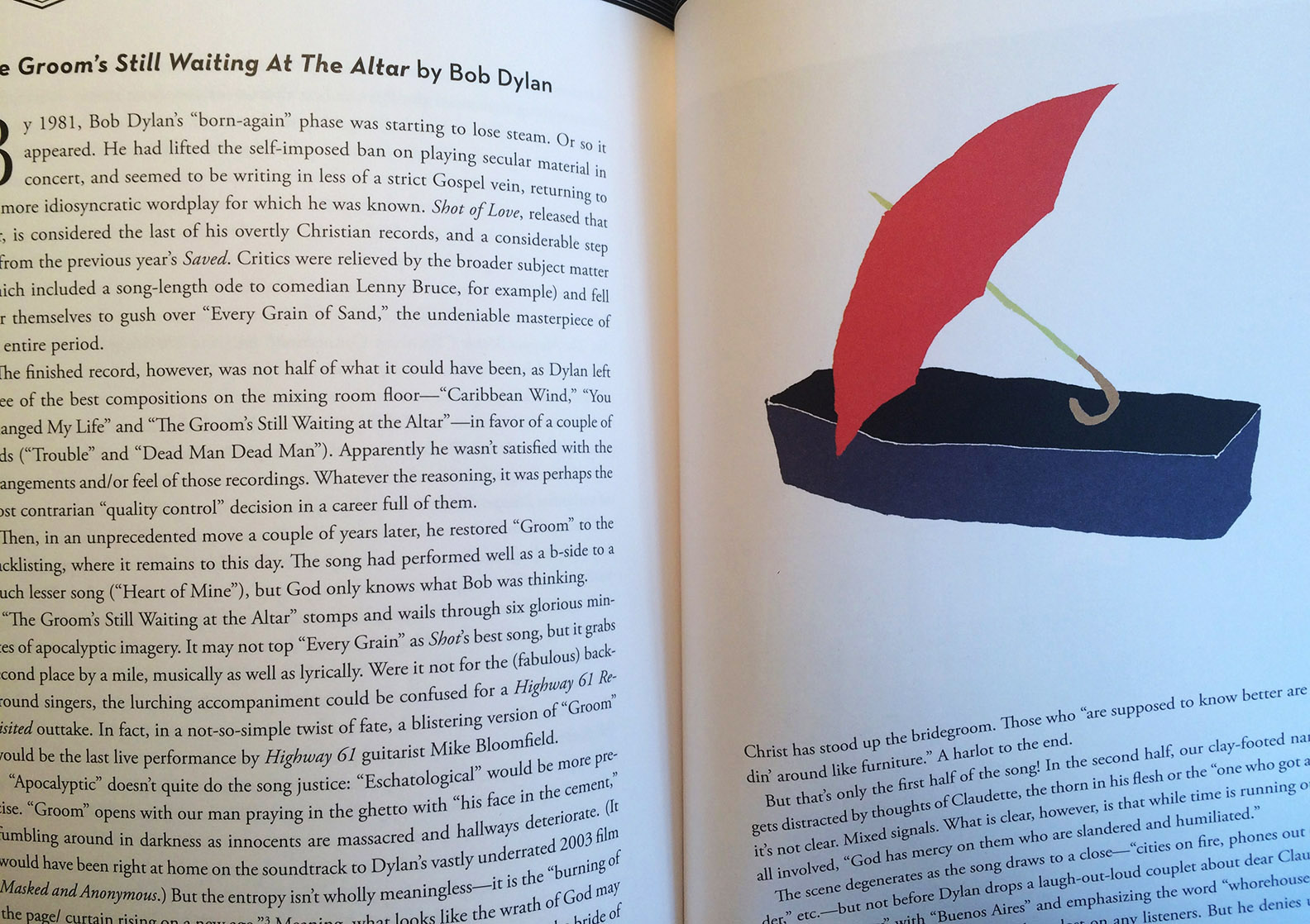
Wednesday, July 13, 2016

Another Drawing for the New York Times Editorial Page

I've been in the rotation this week doing some editorial illustrations for the Times. This editorial was about the secret rules that govern drone targeting and killing of terror suspects. Art director Sarah Williamson suggested the camouflage idea, and I thought of the idea of a curtain being drawn aside to reveal what is going on.

Drawing the drone and the hands and the missile were straightforward enough, but camouflage is harder than you think. It adds visual noise and pattern, and I tend to prefer simplicity, but keeping the palette narrow helped minimize the complexity. Making the hand match the brown tone in the pattern helped tie the image together.

Tuesday, July 12, 2016

A Drawing for the New York Times Opinion Page

 The Times editorial was about how Hillary runs against an unconventional candidate like Trump in swing states like North Carolina where the outsider candidate has a certain appeal. I tried to think what Trump reminded me of. A lot of personality types came to mind but the one that stuck was the junior high malcontent, the bully, the kid in the back of the classroom who shows his contempt for school by disrupting everything. Trump is the kid throwing paper airplanes when someone else is trying to speak.
 The Times needs an image to work both as a vertical and a horizontal for its print and online editions.

The first drawing I did showed Hillary from the side. Because the Times avoids likeness (and satirical caricature) I drew her hair and her outfit, which instantly identify her. In this version I shifted the Hillary figure into a gray tone.

Tuesday, July 5, 2016

Rococo Hairdos

To pass the time I like to draw faces. I have a bias toward men's faces; I think because I like drawing them eccentric or humorous and I hesitate to make fun of women. Does that make sense? Here I am making fun of the hair and doing my best to represent the women with dignity and respect. (Does anyone recognize the dark-haired woman lower right?)

Monday, July 4, 2016

Free Drawing the US Map


A Drawing for July 4th in this free range, freedom-worshipping, libertarian age. When you try to "free draw" something as complex as the map of the states you find how uneasily they sit together. The shape of one state is supposed to nest perfectly into the next but if you aren't rigorously measuring and following the exact outlines they don't match very well at all. Most Americans don't remember the time before FDR's various bureaus and departments knit the states together, and then Eisenhower's interstate highways locked them into a uniform grid. Then the television networks did the same invisibly and the only things dividing us were the time zones. For a period of four decades or so we really were E Pluribus Unum. Before FDR main roads traveling across one state often disappeared at the state border. Time zones and laws of commerce were willy-nilly. Citizens from the north driving across the south were viewed as foreigners. They were liable (if they weren't careful) to find themselves on the wrong side of the local sheriff. Southerners visiting the north encountered outrageous customs that were almost as outrageous as their own. After a pleasant interval we seem to be disuniting again, in opinions and sentiments if not legally.

Monday, June 20, 2016

Gun Crazy


I've been slowly writing a memoir about my unremarkable childhood. The writing has gone on for quite a few years, not because it's painful or because I can't remember. I remember everything. It's not as if I have any buried monsters to exorcise in a rush of creativity. I've complained to my parents over the years about my upbringing. How, if they'd been more horrible to me, I might be a successful author today. But unlike Kipling's parents and Dickens's, my mom and dad were very nice people, tolerant, forgiving, pleasant to be around, encouraging, attentive. A person works with what they're given and if they are given a pleasant childhood, I guess they move naturally into a pleasant adulthood drawing pictures. The only thing violent about my youth is the contrast with the violence I saw and we still see on television and in movies, and wherever folks now walk fully armed like western hombres. One of the chapters of this memoir, published today by the Paris Review, was written a few years ago in a fond reverie but the story seems ironically, and sadly apt in the wake of each new outburst of mass gun killing. Looking back I can barely recognize my nine year-old self.

Thursday, June 16, 2016

London in a Fog

I came across a photograph of London, a foggy skyline, nothing especially striking about it except the chaotic scurry of it. None of the charming rooftops; they'd been overwhelmed by boxy cooling units and concrete cubes. Almost lost in the gray were a couple of landmarks, a Wren spire, the Parliament buildings, Nelson on his column. Sometimes I'll draw things to make sense of them. The London I loved from books growing up is gone. I can't decide if the Luftwaffe or property developers have done the worst damage. I think the latter. The UK is an economy that despises history.

Saturday, June 11, 2016

Consider the Common Housefly

I am the regular illustrator for an irregular feature in the University of Minnesota alumni magazine art directed by my friend Kristi Anderson. The feature is called Tweets of Yore. It takes old news clippings from university history and translates them into tweets. This one was about a professor's studies of the common housefly. I thought of this tweedy chap (glasses, elbow patches, sweater) and added the fly swatter in lieu of a pointer.

Friday, June 10, 2016

Taking Chances

This is another illustration that the client didn't end up using. The subject they needed me to illustrate was "kids taking chances", not in the sense of risking life and limb but risking failure. I thought of those "leaps of faith" we have to persuade ourselves to make. I paired two figures in two tones, one male, one female, to keep the risk an individual thing but avoid gender bias. I am still very pleased with this drawing and hope to see it published some day.

Wednesday, June 8, 2016

An Unused Illustration

I get a lot of work from college magazines. Good ground for me to cover: books, areas of study, ideas, knowledge; my head is full of visual analogies for these abstractions. I generally draw a lot more than is used. This is one drawing I especially liked but the art director preferred another version I did. This one was more minimal, less colorful. They also thought the figure seemed too old. Dressed too old, I think, although when I was that age I remember trying to dress a bit older. A kind of disguise.

Monday, June 6, 2016

A Poster For Steppenwolf Theatre Company

I did this poster to celebrate Steppenwolf Theatre Company of Chicago. The project was art directed by Ogilvy/Chicago. Twelfth Night is my favorite Shakespeare play and I've seen it and read it several times. The aspect that caught my imagination was the pattern of overlapping characters and the multiple faces of the characters in the play.


Friday, June 3, 2016

Another Illustration for the Baffler

Art directed by Patrick JB Flynn.


A Desert Run

This illustration was for my regular back page slot in Macalester Today. Art director Brian Donahue let me try out this new style I'd been working in. I think it worked out especially well. This style requires clear outlines and a context that can be simplified. I also need to work from reference, especially for figures. The essay was about a marathon run in the desert, so a certain amount of my time was spent working out what actually happened; the idea of running a marathon on sand in extreme desert heat seemed so improbable it took me a while to get my head around it.


A Gelato Map of Rome

I did this map for Food + City magazine, art directed and designed by Julie Savasky of Pentagram/Austin. Having spent time in Rome eating gelato it was a delicious project. Too bad they don't send artists on location.


Creating Lots of Art Around OneTopic

I did these illustrations recently for The Mockingbird, an Episcopal magazine designed by Tom Martin Design. A particularly fun project because I was given complete freedom to create imagery on the topic of church and religious ritual. It gave me a chance to create a lot of art using this new collage technique. These are just a few.